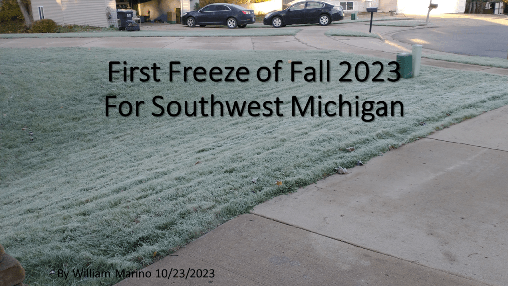
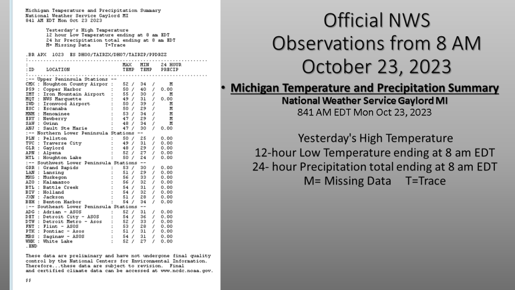
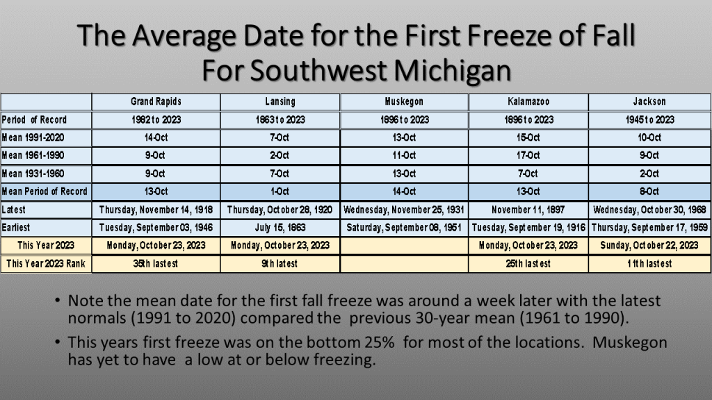
Here is a quick look at what the low temperatures were this morning over all of Lower Michigan, and a summary of what is normal for a few selected stations in Southwest Michigan. This year, at most stations the first freeze was later than what would be the mean first freeze date.


Bill….Forgive me but I think the color table on your map is really awful. I know for the past several years, the Western Region of the NWS has been using this color table. I have emailed the western region in Salt Lake City to complain about how difficult it is to read the numbers. I did get a response that they would look into it but that is the last I heard. My friend the art teacher would give this graphic a “D” for clarity of presentation. LOL.
Craig
LikeLike
Since I did three blogs between the 23 and 24th, which of the color tables do you not like? I could change where I get the charts from if it’s the 500mb heights and anomalies but if it’s the Southern Region chart with the number of 32F days, I can’t change that. If it’s the freeze trend chart, that is from the Midwest Climate Center, I could send them a message.
I wish I could figure out how to make it so you can click on one of my images and make it bigger, I have to work on that idea more, since I think a lot of this is really to small.
I do appreciate comments that can help my blog look better!
LikeLike
It was the chart of actual low temps across our area. Western Region uses this color table for both precipitation and temps. Everything is in shades of light green, light blue and light yellow. I think the numbers should at least have a one pixel width black border around them to make them stand out,
Thanks
Craig
LikeLike
The article was the one showing the freezing temperatures across our area. It seems to me a map with this color table needs to have each number have at least a one pixel black border to make it stand out better.
LikeLike
Thanks Craig,
I will try to put labels on these maps that stand out better in the future.
Bill
LikeLike